Thursday, April 22, 2010

After the first round of model building (and subsequent re-examination of what I wanted for my building), I set out to make a detailed, master model and revised set of drawings.

I decided to make a couple moves that I had been considering, with the knowledge that they would undergo a post-critique revision.

Here is what I came up with:

NORTH SECTION


SOUTH SECTION


LOWER LEVEL PLAN


WEST SECTION (COMPOSITE WITH EARLIER WEST FACADE DRAWING)


MODEL AXONS

LEVEL 1


LEVEL 2


ROOF LEVEL


In retrospect (with another critique under my belt), I feel like I may have overthought my latest iteration. I complicated a couple elements I didn't necessarily need to.

In my next version, I hope that I can scale back some of the elements to achieve a greater economy of design, while maintaining the integrity of my initial ideas and the precedent project elements I've looked to incorporate.

I'll keep you posted.

MORE PRECEDENT

This first round of model-building (which took much longer than a quick set of pictures might indicate) pushed me to examine some other works than I hoped to emulate.

In my desire to create a usable, visually interesting space underneath my carpet/cave roof, I looked at a pair of works by Herzog & de Meuron.

1. M.H. de Young Memorial Museum (San Francisco, CA / Herzog & de Meuron, 2005)


The bulky, overhanging piece was particularly attractive, as were the large gaps in the roof plane (which I had toyed with in my last model iteration). I also appreciated the interior courtyards created by those gaps, and the glassed scenic overlooks.

2. Dominus Winery Estate (Napa Valley, CA / Herzog & de Meuron, 1996)


The emphasis on the natural environment highlighted in the winery project was something else I hoped to incorporate into my final design. It's punched-hole, landscape-framing portals and balcony views were inspiring.

I was also partial to this green roof by Tadao Ando, and the way it looked "punched out" of the roof plane.

3. Art Site Naoshima Annex (Kagawa, Japan / Tadao Ando, 1992)


FIRST MODEL BUILDING PHASE

After the initial drawings (and the ensuing critique), I started building models.

It became apparent that the elliptical, curved ramps weren't working, so I reduced my secondary exploration to the "carpet-peeling" concept.

These are some of those first iterations:


One of the more successful interpretations:


INITIAL IDEAS

At the outset, I decided to treat the garage-top plane as a piece of carpet.

By lifting up this plane, a void is created underneath. Viewed from off site, this condition would cause the viewer to try to explore what is housed in the space below; from on site, it would encourage the occupant of this void to peer out.

These two concepts, combined with the site's vantage point of the landscape, became my initial focus. I wanted people viewing the structure from the river side to look in, and people inside the structure to look out. I also hoped to incorporate that under-the-carpet quality, as well as a green roof (my grass carpet).

To do this, I looked at precedent for inspiration.

1. Nanyang Technical Institute (Singapore, China / Kenzo Tange, 1986)


I really appreciated the sloping green roofs. Coupled with the glass underneath, I thought it highlighted that "peel" effect I was hoping to create.

2. Sainsbury Centre for Visual Arts (East Anglia, Norwich / Norman Foster, 1978)


This building's rigid, framed exterior and glass curtain wall really appealed to me. The fact that it reflects the sun and surrounding environment during the day was important, because of our site's exposure to the sun. The view from the interior is intriguing, as well; it allows the occupants to peer out, as if they were inside of a cave. As you can see in the last image, this same glass wall gives the structure a fish tank effect at night.

These two buildings informed my first design drawings the most. I strove to create something that grew up from the top of our garage; a building that allowed observers to peer in from afar and its occupants to take in the framed views.


Monday, March 29, 2010

We would like only, for once, to get to where we are already.
- Martin Heidegger, Language

WASTELAND


BEFORE & AFTER

BEFORE:
Exposed
Desolate
Systematic
Mundane
Expansive
Strict
Planar
Bland
Barren
PALETTE

AFTER:

Growing
Plush
Inviting
Organic
Stimulating
Fertile
Productive
Natural
Distinctive
REFUGE

Sunday, March 28, 2010

Site Description

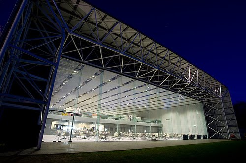
At first glance, the Lafayette St. Parking Garage appears boring, a cookie cutter, and logistical necessity. Its beige exterior is bland and uninteresting. If driving by, one would hardly notice it. In contrast to some of the more exciting structures (and even other parking garages) around it, the regimented, strictly functional form is monotonous. Its drab colors and simple design make it fade into its surrounding structures.

However, what at first appears to be a hulking, clumsy mass of concrete, is actually an ordered system of intersecting planes. The vertically-oriented exterior columns reach skyward; the perpendicular, open middle levels provide a contrasting element to the columns, creating dark cut-outs in the block-like façade. All sides look mostly the same, although the columns have different spacing.

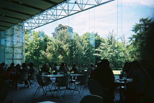
The journey to the top of the complex is stale, as well. Either option, stairs or elevator, are equally boring. The stair windows are covered with bars, and the elevator doesn’t have any windows at all. Similarly, upon arriving at the top floor, there aren’t many points of interest in the garage’s design. The square, dark concrete posts serve to break up the enormous plane, as do the ramps that provide a view into the floors beneath. Nevertheless, the vibe of this uppermost floor is banal, at best. The expansive upper space is empty, containing only the residual order of seven stories of structure below.

The table-like seventh story serves as a lookout tower for those that make it to the top. From the garage roof, one’s view is unrestrained. A couple of large buildings shoot up in close proximity on the North and East sides, but the views to the West and South are largely uninterrupted. The substantial view of the river and downtown area provide ample visual interest. The ample space begs the question, what can be built here?

Perched atop its lofty parking garage nest, the Artist’s Studio conjures images of ancient structures, peeking out from their mountainside homes. It appears to grow from its imposing base, as a small plant from a giant terracotta pot. It’s organic, inviting form not only takes advantage of the view, but serves as a stark contrast to the cyclopean table that supports its weight.


Views of building elements from ground level provide visual interest without revealing its form entirely. It beckons to pedestrians to investigate further.

Friday, March 26, 2010


Site 360

Panorama from the Mississippi River side